
Brand Color Part I: What Color Is Your Brand?
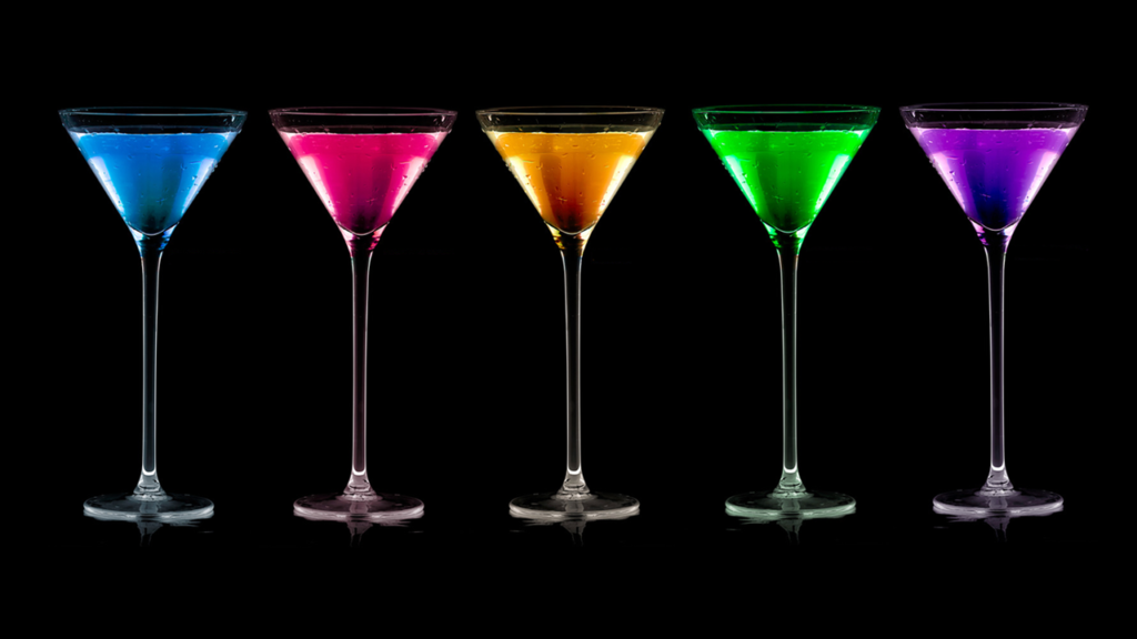
When it comes to selecting a color for your brand, there’s more to the process than spinning the color wheel and letting the dial land where it may or opting for your favorite color. Choosing a color for your personal or business branding is a bit more detailed and starts with word association. There are a kaleidoscope of colors at your fingertips but selecting just the right hue for your brand is essential to connecting with customers and can visually say volumes about your brand.
According to research from Colorcom, people make subconscious judgments about a person, environment, or product within 90 seconds of initial viewing and between 62% and 90% of that assessment is based on color alone.
So choosing a color for your brand is serious business. Where to start? The color selection process begins with the Reach Branding 360Survey tool for personal branding clients to determine their brand attributes. I help companies find their brand attributes through customer feedback. Knowing these key word associations is key to determining matching brand colors.
Another source is cymbolism.com, which “attempts to quantify the association between colors and words, making it simple for designers to choose the best colors for the desired emotional effect.” Cymbolism also hosts an interactive survey of color and word associations. You click through a series of words and choose the color that you think best represents that word. Is friendly yellow or green? Do you think romantic is red or purple? Your answers are aggregated and you can see most popular associations either by color or by word, as well as well-known logos in those colors.
Are any of those colors looking particularly good to you? Here are a few questions to ask yourself: Could I use more than one color? If more than one color calls your name (and those two colors are complimentary) go ahead! There are lots of successful businesses (Ebay, Google) that have multicolored logos.
What colors does my main competitor use? Because you (obviously) do not want to use the same color as your competitor. You don’t really want to use a color that’s even close. In fact, how do you feel about the colors on the opposite side of the color wheel?
Are there any cultural connotations to this color? If you live in a culturally diverse area or regularly do business with people from another culture, this is something worth looking into. It’s worth noting that Chinese culture considers yellow to be the ‘best’ color while white is the color of mourning. Hindus consider orange to be a sacred color and blue is holy in Israel.
How do people feel when they see this color? If you are a meditation center or yoga retreat, perhaps the energy of yellow is not the best choice for you. And if you’re a maid service? Maybe stay away from brown, right? In coming posts we will explore six different colors in depth and how to select a hue based on your brand attributes.
Check out the Reach Personal Branding Video below:
Responses